23. November 2023 By Stephan Ziemke
An efficient way to develop UIs with Storybook: a how-to guide to Angular
To begin, we will provide some basic facts and information about Storybook and explain why it plays such an important role in UI development.
What is Storybook and why is it important?
Storybook is a powerful tool for front-end developers that allows them to create and test UI components in an isolated environment. It is an interactive platform on which developers can develop and present their app’s user interfaces separate from the rest of the app. This comes in particularly handy when carrying out fast design iterations and in order to ensure consistency across different components.
What added value does a shared UI library provide?
A shared UI library is a collection of reusable components that can be deployed in different projects or used by different teams. Storybook makes it easier to develop and maintain shared libraries by providing a central platform for use in visualising and testing these components. By reusing established components, teams can reduce development times, increase consistency in design and ensure a uniform user experience across different applications and services. Because of this, Storybook has a key role to play in the implementation of efficient and consistent design practices.
Practical insights about Storybook with Angular: the basics
Button component (example for illustrative purposes)
As an example of a simple Angular component, we will be using a MyButtonComponent button. The aim is to be able to adapt and customise the appearance and behaviour of the button. To make this possible, we define the inputs ‘inverted’, ‘size’ and ‘label’. Here is how these inputs are used:
- Inverted: alternative style and hover effect
- Size: size of the button
- Label: text on the button
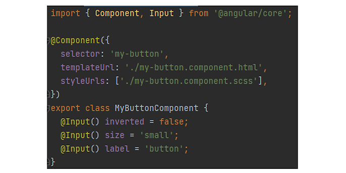
Figure 1: Inputs of the button component including default values
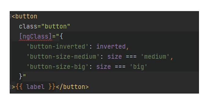
Figure 2: Use of the inputs in the template for the button component
Constructing simple stories
A simple stories class consists of:
- Definition of metadata: contains configurations such as the component type, tags and argTypes
- Export metadata: exports the defined metadata as a standard export. This metadata is used by Storybook to visualise the component and its controls in the user interface.
- Definition of story types: creates a new type of story, which is a StoryObj with the type MyButtonComponent, for example. This is done to typify the subsequent story definitions.
- Definition of individual stories: each story is defined as an object that contains the args (arguments) for the relevant story.
The metadata of the stories class for the MyButtonComponent is structured as follows:
- Component: the component type
- Tags: Storybook Autodocs is a tool used to automatically generate component documentation. For more on this, see Figure 5.
- argTypes: defines the arguments that can be used for the story, along with descriptions and optional settings such as the control type and options. In this case, the arguments are label, size and inverted.
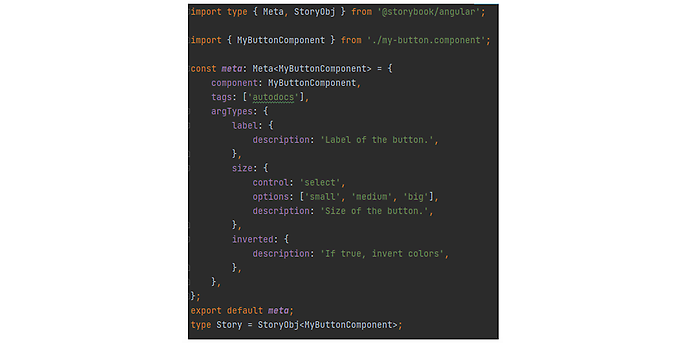
Figure 3: Metadata of the stories class
When defining individual stories, we are looking to address the specific properties of MyButtonComponent and present them in different ways and in different combinations. Go to Figure 4 where you can find a number of sample definitions. Here is a short description of the individual properties:
- MediumButton: a medium-sized button with the label ‘Button’
- SmallButton: a small button with the label ‘Button’
- MediumButtonInverted: a medium-sized button in the inverted style with the label ‘Button’
- BigButton: a big button with the label ‘Button’
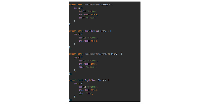
Figure 4: Story definitions
Visualisation and interaction with components in Storybook
Once we have created the stories for our component, they can now be visualised and the user can interact with them in the Storybook UI shown in the browser. Figure 5 provides an overview of the stories for MyButtonComponent generated by our stories class. You can see the four buttons defined in our stories as well as the documentation generated by Storybook Autodocs. This is based on the argTypes we previously specified. This documentation is also used to interact with our stories by adapting the component properties. In the story overview in Figure 5, our first story – ‘Medium Button’ – can be customised as an example.
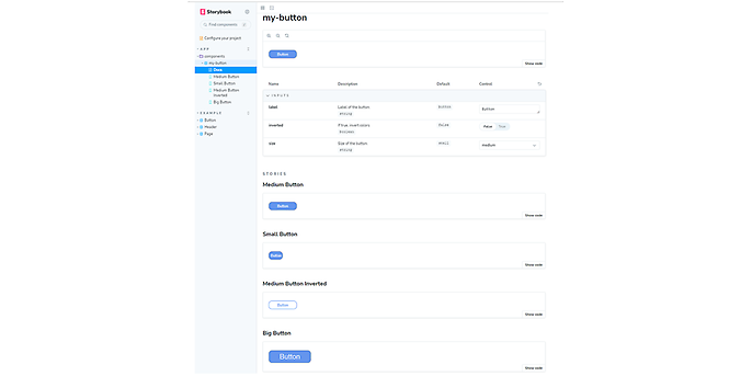
Figure 5: Storybook UI – an overview
In addition to the story overview, we can also view individual stories and interact with them. In Figure 6 we see the ‘Big Button’ story. The button and the component properties are also shown.
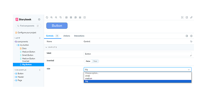
Figure 6: Big Button story
Using Storybook to augment a UI library
In this section, I would like to focus on how Storybook can make a key contribution to augmenting and improving a UI library. Our focus will be on the following key aspects: visualisation, documentation and the resulting increase in the consistency and reusability of components.
- Visualisation of components: Storybook gives you a detailed view of UI components in different states and contexts. This isolated view helps you to ensure the design is consistent and that each component works as expected in every situation.
- Documentation of components: Storybook allows you to create full documentation for each component. This provides clear instructions and examples, making it easier to understand and use the components correctly in different projects.
- Increase in consistency and reusability: Visualisation and documentation in combination with each other in Storybook make it easy to develop consistent and reusable components. Developers and designers get a quick overview of existing elements, which increases efficiency and reduces inconsistencies.
By making it easier to create, visualise and document UI components and optimising each of these steps, Storybook plays a central role in the creation and maintenance of a powerful, coherent UI library that can serve as a basis for numerous projects and teams.
Tips and tricks on how to use Storybook effectively in Angular projects
Here I would like to share a few practical tips and bits of advice that will help you get the most out of Storybook in your Angular projects.
Integrating Storybook into your development process can significantly increase productivity. Here are a few tips on how to create efficient workflows:
- Component focus: Start by building small, isolated components in Storybook before integrating them into larger applications. This allows you to spot errors early on and maximise reusability.
- Iterative design: Use Storybook to quickly run through design iterations. Experiment with different states and versions of your components to find the best design.
Troubleshooting: complex application integration
A common problem encountered when using Storybook involves the integration of components developed in isolation into complex application structures. These components often function perfectly fine on their own, but show inconsistencies when interacting with other elements. This is usually because they have not been adequately tested in combination with each other.
To avoid such issues during integration, the following approach has proved to be a good choice: In Storybook, develop stories specifically to test different components in realistic combinations. For example, it makes sense to simulate the interaction of components that are frequently used in forms. This approach allows you to gain a deeper understanding of the interaction between components and helps you identify and solve potential problems at an early stage.
Outlook
Storybook offers a wide range of functions and options that go beyond the basic ones covered in this blog post. Here are a few examples:
- Storybook add-ons: there are a variety of add-ons available that offer advanced functions such as accessibility tests
- Mobile Development: support for mobile frameworks such as React Native
- Storybook Deploy: publication of storybook projects as static web pages
- Storybook Docs: automatic conversion of stories to create comprehensive documentation
If you would like to find out more about Storybook, please check out the official Storybook documentation here: https://storybook.js.org/docs/angular/get-started/install/
Would you like to learn more about exciting topics from the world of adesso? Then check out our latest blog posts.

