8. August 2023 By Anna Ovcharova
Every user counts – the synergy between UX/UI design and accessibility
What is digital accessibility?
Put simply, digital accessibility means that everyone, regardless of their disability, can use digital products.
If we want to develop an accessible product, then we should ask ourselves which user groups we have, what their needs are and what usage contexts are important to them.
Why is digital accessibility often neglected?
Unfortunately, project teams often intend to make their solution accessible, but fail to put this intention into practice. Why is that?
- Firstly, it is difficult to adapt something that you do not have a good understanding of. Most of the time, it is not that the team lacks motivation, but rather the knowledge about how disabilities prevent people from interacting with our website.
- Secondly, it takes a certain amount of effort to make an application accessible – starting with knowing what the standards are through to designing the functions and properties the application needs. Then you need to test whether the approach has led to the desired result – and much of the testing can only be done manually.
- Thirdly, it is a common misconception that digital accessibility only benefits people with disabilities and that considering this minority is therefore not worthwhile. This is something I have heard constantly throughout my career and I am going to explain why it is completely wrong.
Why is digital accessibility important?
In the digital age, accessibility is a key part of inclusion and having an equal user experience. In particular, learning and developing accessible digital solutions will make the Internet more accessible to all. Here are two examples:
A person without a disability or hearing impairment who wants to watch something on their smartphone on public transport without headphones will be forced to wait to watch a TV show or learning materials if they are not subtitled. Or they will at least, if they are one of the many who prefer to watch videos in public without sound.
It is difficult to use a mobile phone while you are carrying heavy bags – it turns studying a map, writing a message or calling someone into a complicated juggling act. The fewer actions a user has to perform with their fingers in this situation, the more comfortable it is for them.
These examples show that disabilities cannot only be permanent issues, but also temporary hindrances in specific situations. If we also consider challenging usage environments, it becomes extremely likely that everyone can benefit from accessible web services.
Removing obstacles right from the start – accessible UX and UI design
Let us imagine we are in the following situation: our team has decided to develop a project with accessibility in mind right from the very start. During the planning phase, we need to ask ourselves who our users are and what challenges they might encounter on their user journey. We also need to determine which legal requirements our product needs to meet.
In the German-speaking world, our main focus should be on following the Accessible Information Technology Ordinance in accordance with the German Disability Equality Act (Verordnung zur Schaffung barrierefreier Informationstechnik nach dem Behindertengleichstellungsgesetz, BITV 2.0). This legislation is based on the World Wide Web Consortium’s (W3C) international Web Content Accessibility Guidelines (WCAG 2.1).
WCAG 2.1 divides digital accessibility requirements into different levels of compliance:
- Level A: This level represents the most basic accessibility requirements. If a network connection portal meets the Level A requirements, then some barriers for people with disabilities have already been removed.
- Level AA: This level places higher demands on accessibility. A network connection portal that is level AA compliant offers significantly improved accessibility and accommodates a wider range of disabilities.
- Level AAA: This level places the highest demands on accessibility. A network connection portal that is level AAA compliant has removed all barriers and provides maximum accessibility for people with disabilities.
My job is to ensure that the product design meets the level AA accessibility standard. Let us now turn our attention to the main things you should look out for during the initial phase of a project to avoid creating a lot of problems for yourself later down the line.
Images with alt text
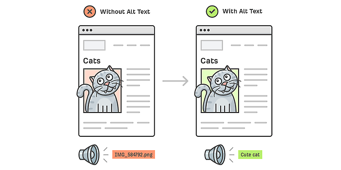
Have you added alt text for graphical elements such as pictures, maps, diagrams, tables, Word Art and the like? This text enables screen readers used by blind people to describe the content and purpose of images. Images without alt text cause problems for screen readers because the content of the image cannot be communicated to the user. They usually skip these images or worse, they read out the long, useless file names for the images.

Images with and without alt text – source: https://ahrefs.com/blog/alt-text/
Colours with vision – focus on accessibility
Colour design is as important for accessibility as alt texts are for images. We should not omit them from the information architecture even if visually impaired and blind people struggle to perceive colours or cannot do so at all. Quite the opposite, in fact – when used correctly, colours can significantly improve usability and accessibility. When using colours, keep in mind that:
- It must be possible to identify all the elements even if they are not in colour. This also includes the multi-channel principle: any information must always be conveyed in at least two ways.
- You need to think about colour-blind users in your design. You should provide alternatives if you are presenting information that uses certain colours to distinguish between different elements, such as in charts and graphs. A good solution here is to add patterns and textures to diagrams. Adding text labels to the segments make it easier for the user to understand the information being presented.

A comparison of bar charts with and without patterns. Source: https://uxplanet.org/make-your-design-accessible-to-color-blind-users-fc16a47b621e
Clear messages – opening up worlds with accessible text
Colours are not the only thing that is crucial to an accessible design – the text is, too. What do you need to remember when deciding how to present your text?
- Texts should be left-aligned to help make things easier for users with dyslexia. This alignment will also improve readability for other users, as it will prevent them from having display problems if they zoom in on the web page.
- Certain fonts can also improve readability. As a rule of thumb, you should use sans serif fonts for electronic media, as reading text in electronic format is significantly different to reading printed text.
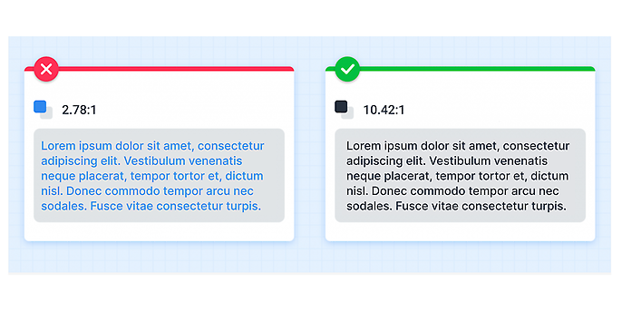
- Colours are also important for text. If the foreground and background colours have a similar level of brightness, then the contrast between them may be too low. Having a sufficient level of contrast makes it easier for the user to read the text. People with limited visual acuity, colour-blindness or age-related contrast sensitivity in particular benefit from clear contrasts. The contrast ratio for font sizes below 24 px should be 4.5:1 for level AA. If in doubt, always use a higher colour contrast.

Differences in color choice
Accessibility at the touch of a button
Before a website goes online, it is usually tested to see if it meets users’ expectations. This testing mostly involves using the mouse. The keyboard, on the other hand, is often forgotten about. But it is important to know that being able to navigate and use a website with a keyboard is a critical criterion according to the WCAG guidelines.
Sadly, this issue is a relatively unknown one despite affecting a large number of people. Not everyone can see everything on a website or navigate it with a mouse or touchpad, which is why you need to make sure that all elements can be operated using the keyboard.
You also need to have a clear, visible focus indicator for the concept’s elements. For keyboard users, this is the cursor. By designing and implementing accessible focus indicators, we can make our products accessible to keyboard users and to people who use assistive technology that works with a keyboard or emulates keyboard functions, such as voice control or button control.
Going further
Unfortunately, this blog post is not long enough to explain everything about digital accessibility in detail. There are many other aspects that need to be considered in an accessible UX/UI design in addition to colours, text and keyboard operation.
Above all, it is important to take the first steps towards accessible design to make digital products accessible to all users.
Conclusion
Digital accessibility is crucial to ensure that everyone can use digital products regardless of their limitations. It is often neglected, but is vital to inclusion and ensuring everyone has the same user experience.
Inclusive UX/UI design with alt texts for images, adapted colours, fonts and keyboard operation are the key to accessible products. Integrating accessibility from the start creates an inclusive online world for all.
Would you like to learn more about exciting topics from the adesso world? Then take a look at our blog posts that have appeared so far.
Also interesting:

